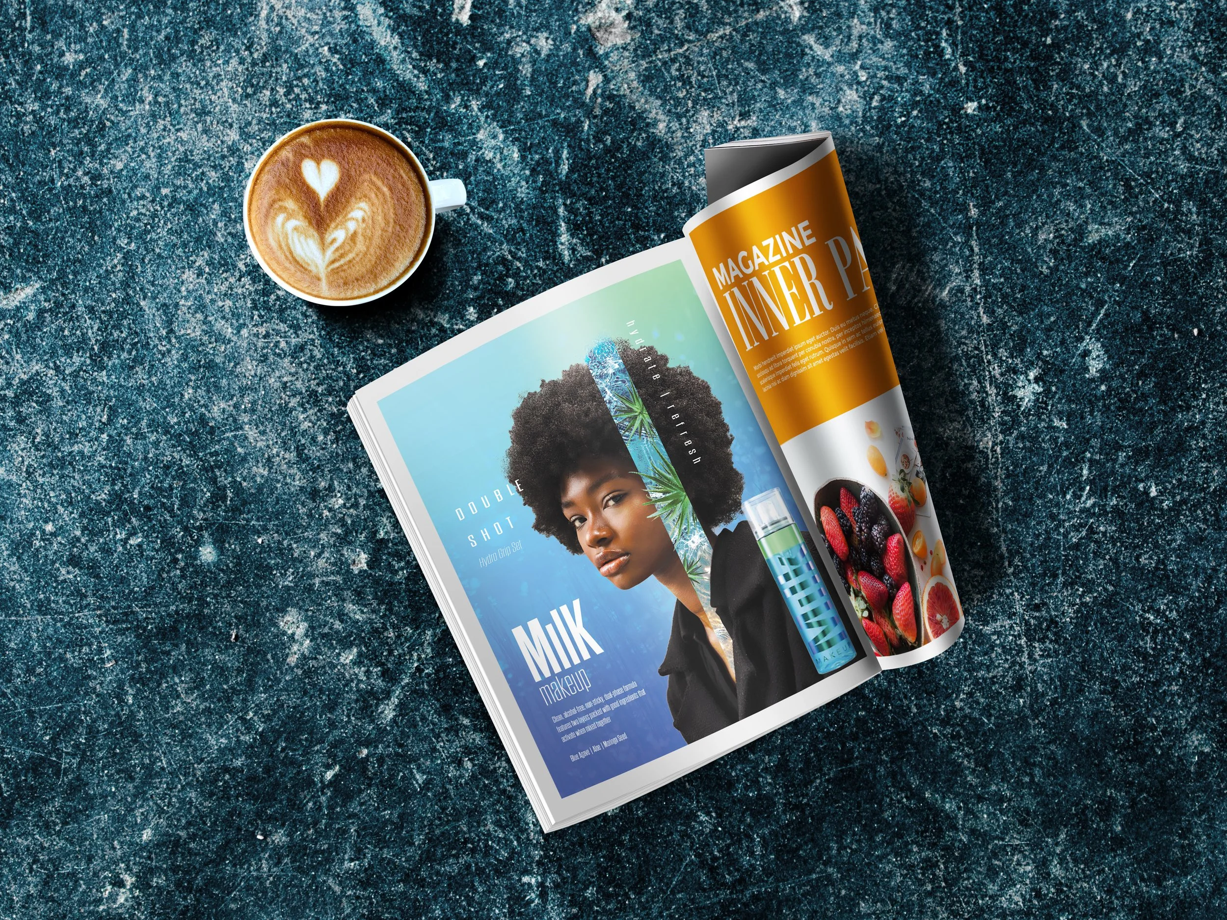
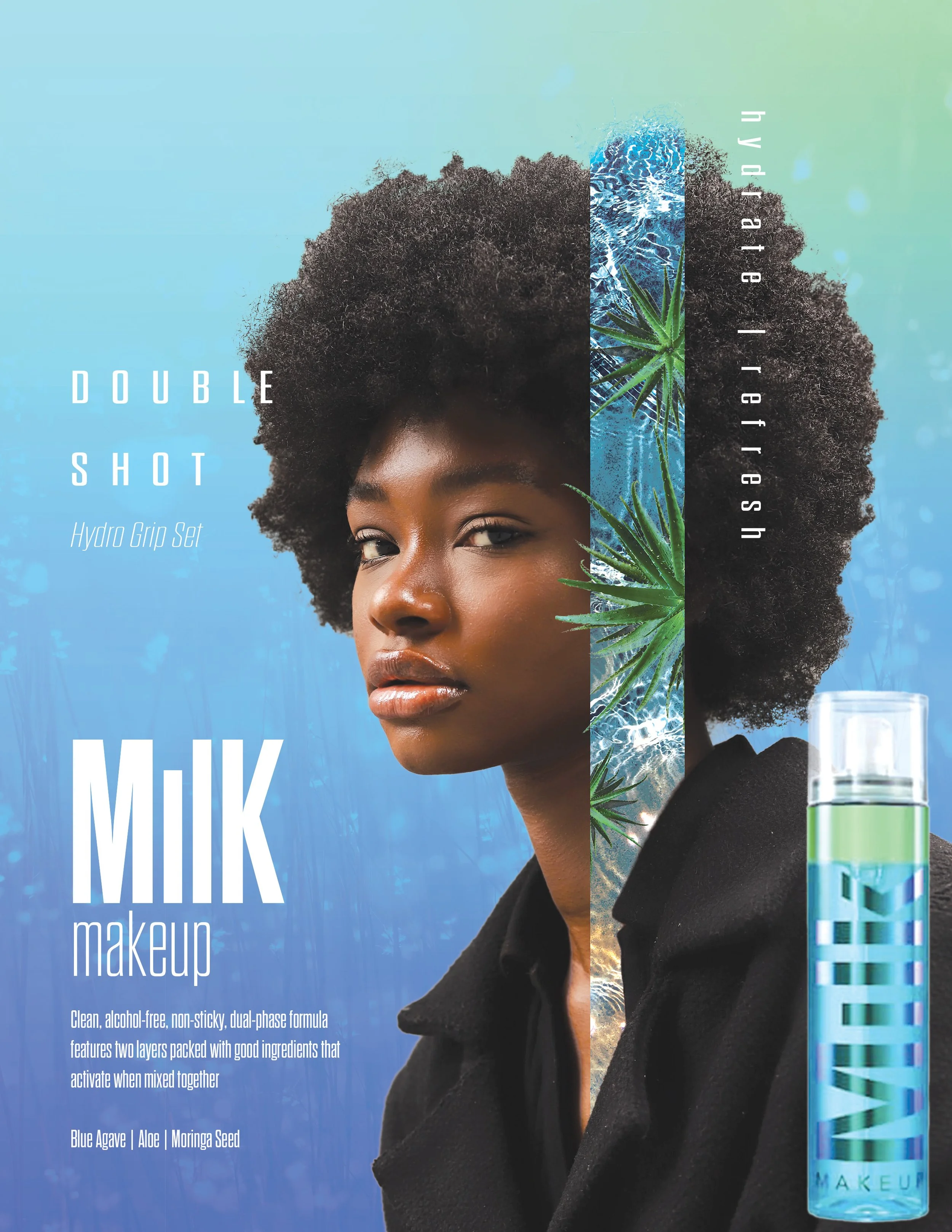
MILK Makeup Magazine
Magazine Mockup for Setting Spray Product
Software Used: Photoshop
When working on this project I wanted to highlight the model’s natural beauty and the colors of the product. For the hair I used the color range tool to select the hair within the rectangle’s range and get the fine detail for the mask. The rectangle shape with the water details needed to look like it was emerging from behind the shirt so I took a mask, copied, and layered the shirt on top to get that effect. The product was a last minute addition, originally the concept did not have the bottle so it could feel more person centered. However, the addition was made for clarification for the audience I was presenting this layout to.
AIGA GIT Awards
Industry Awards are voted on by local design leaders from projects submitted by freshman to graduates, individuals to teams


